-1.png?width=300&name=%5BEN%5D%204.0%20Launch_Community%20Banner%20(3)-1.png)
We are excited to introduce a new era for Naluri with the launch of our new logo and refreshed colour palette. As a company committed to delivering accessible and holistic healthcare across the region, we believe this revitalised branding captures the essence of our journey and our vision for the future.
“Throughout the years, Naluri’s approach to innovating and delivering public care has adapted and evolved. As our product continues to grow, one constant has remained unwavering: our steadfast commitment to making holistic care accessible. With the launch of the new major product update, we saw this as the perfect opportunity to refresh the brand to represent this new chapter of Naluri and better align how we communicate our vision, values, and objectives.”
- Thum Yin Teng, Head of Design
The Naluri logo

After 6 years, Naluri is updating its logo. The new design emphasises the name while making strong use of the Naluri Teal colour and the all-new Naluri Companion.
The lines are bolder; the colours are simpler – a reflection of the precision and innovation that we bring to the world of health and wellness. This refinement signifies our growth and maturity, echoing our ever-evolving knowledge and expertise in empowering our members to lead a healthier, happier life.
The Naluri Companions are now at the core of our logo. These charming, featureless shapes hold profound significance. Much like your journey towards health and wellbeing, the Naluri Companion is adaptable, approachable, and without predefined boundaries. Featuring Nano, your steadfast and cherished companion on your wellness journey, this warm-hearted companion represents the (growing) family of Naluri Companions and whose ultimate mission is to empower you to take the reigns of your health and wellness journey.
The Naluri colour palette

Our colour palette has also undergone a subtle transformation, mirroring our commitment to adapting to the dynamic market while preserving the core essence of Naluri.
The primary brand colour, also known as Naluri Teal, has been known to represent positivity, strength and empowerment due to its cool yet vibrant appearance. The soothing and rejuvenating blue-green hue infuses growth and trust into the brand, symbolising the balance and synergy we strive to help you achieve in your health and wellbeing journey.
For our secondary colours, we carefully chose colours that evoked a specific meaning and reflected the multifaceted nature of holistic wellness:
Serene Blue - Mental wellbeing
Our serene shade of blue symbolises the importance of mental wellness. We understand that a healthy mind is the cornerstone of overall wellbeing. As we guide our members through their wellness journey, this colour reflects the tranquillity and clarity that come from nurturing mental health.
Vital Green - Physical wellbeing
The vibrant green in our palette represents physical health and vitality. Just as nature thrives in green surroundings, our bodies thrive when we prioritise physical wellbeing. From nutrition to exercise, this colour encapsulates the energy and growth that come from taking care of your body.
Lively Peach - Embracing wellness
The soft and inviting peach hue embodies our holistic approach towards nurturing overall health and wellbeing, including adopting healthier habits and managing chronic conditions. This colour signifies the gentle encouragement and support to adopt a proactive and positive attitude towards taking care of various aspects of health, such as physical health and mental health.
Savvy Purple - Industry insight
Purple, a colour often associated with wisdom and insight, is a nod to our in-depth industry knowledge. As leaders in the health and wellness space, we provide you with cutting-edge insights and innovative solutions. This colour reflects our dedication to staying informed and guiding you through the latest industry advancements.
Naluri Companions
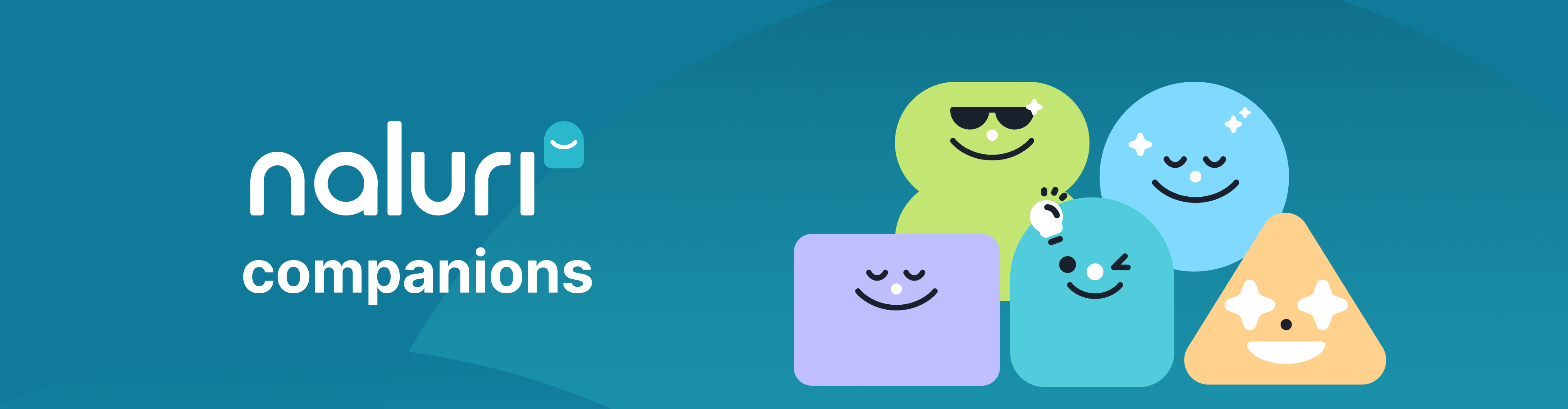
We are proud to introduce a (growing) family of companions who will be at the centre of how we aim to communicate with our members.
As colourful and playful shapes that lack specific defining features, Naluri Companions are versatile and relatable to a wide audience. They offer a non-threatening and approachable representation that can effectively communicate complex health concepts and navigate sensitive subjects like mental health without reinforcing stereotypes or perpetuating stigmas.
Embracing the future, preserving the past
Our logo and colour updates are not a departure from who we are but a celebration of our growth and a testament to our determination to meet your evolving needs. As the health and wellness industry continues to evolve, we understand the importance of staying agile and relevant.
Rest assured, our commitment to you and your team’s wellbeing remains unwavering. Our refreshed logo and updated colours serve as a reminder of the dynamic journey we’re on together – a journey fueled by knowledge, compassion, and the desire to see our members healthier and happier.
Here’s to embracing the future while preserving the essence of who we are – your dedicated partner in health and wellbeing.
With warmth and anticipation,
The Naluri Team
Download or update your Naluri App via the App Store or Google Play, or experience Naluri Web!